A great big thank you to my paid supporters! You're keeping Not-Ship's mission of data democratization alive. Want to join this fine group of people? Upgrade now! Remember: This newsletter is free for everyone, but not free to make. If you can pay, you should.
💙 Amanda
Rich people live in the shadows.
No, but literally.
A new study mapped shade and income levels across thousands of neighbourhoods in nine cities: Amsterdam, Barcelona, Belém, Boston, Hong Kong, Milan, Rio de Janeiro, Stockholm and Sydney.
In nearly all nine cities, shade was a privilege of the wealthy.
"Strictly by looking at which areas are shaded, we can tell where rich people and poor people live," said Fabio Duarte, a researcher from MIT's Senseable City Lab.
Of those cities, Hong Kong shows some of the most extreme shade segregation. In the North, there are low-income/low-shade clusters, while closer to the centre the zones get richer and shadier. Most of the shade, and most of the rich, can be found on Hong Kong Island.
The following maps all show the relative shade cover across neighbourhoods. I've also highlighted the wealthiest areas for each.
Average shade levels in Hong Kong
In the study itself, you can find bivariate maps showing both the income and shade variables at the same time. I find those kinds of charts a bit tough to read, though if you put in the effort, they will give you an even stronger sense of the shade disparity.
Over to Australia now. Sydney's shade coverage has an interesting east-west divide. High-income neighbourhoods, particularly in the northeast and coastal areas, also have more shade.
Average shade levels in Sydney
In Sydney's shadeless suburbs, low building density is part of the problem — fewer structures to block the sun, and not enough trees to make up for it.
In Amsterdam, wealthier central areas, particularly those near the museums and canals, tend to have more shade.
Average shade levels in Amsterdam
Stockholm is an interesting case. Of all nine cities, it has the highest overall shade coverage, yet it also has some of the highest inequality. Though the least-shaded neighbourhoods in Stockholm are better off than the most-shaded in some other cities, wealthy areas still receive disproportionately more.
Average shade levels in Stockholm
According to the researchers, Stockholm's consistently high levels of shade is likely the result of smart urban planning that combines tall buildings, narrow streets and green infrastructure to reduce hot spots.
Surprisingly, Barcelona bucks the trend. There's a relatively even spread of low-to-moderate shade across the city. And poorer areas actually have more shade than the wealthier ones. This is the case in Milan, too.
Average shade levels in Barcelona
Though Milan and Barcelona are exceptions, the findings of the study were still strong: The rich are shadier.
This isn't just a question of neighbourhood aesthetics. It's a real health concern. Extreme heat is the main cause of weather-related death globally. And it's getting more dire as rising temperatures make summers hotter. Shade can be a lifesaver.
"With increasing temperatures, providing shade is an essential public amenity," Duarte told MIT News. "I think providing shade in pedestrian spaces should almost be a public right."
SHADY HISTORY
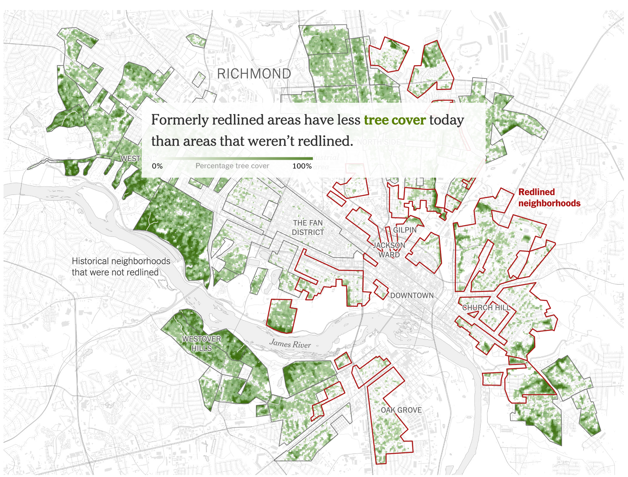
Across a study of 5,723 American municipalities, 92% of poorer blocks had less tree cover than wealthy blocks. In the US, these shade inequalities often have a dark past.
Starting in the 1930s, the residents of Black and immigrant neighbourhoods across the US were systematically denied mortgages. It was called redlining, and that discrimination is reflected in the shade: Today, areas where non-White homeowners were shut out are mostly low-income — and have significantly fewer trees.
Back in 2020, Nadja Popovich and Brad Plumer did some incredible reporting on the environmental impact of redlining. Check it out. It continues to be one of the best pieces of climate journalism I've read.
FROM ELSEWHERE
Here's what I found interesting, important or delightful this week:
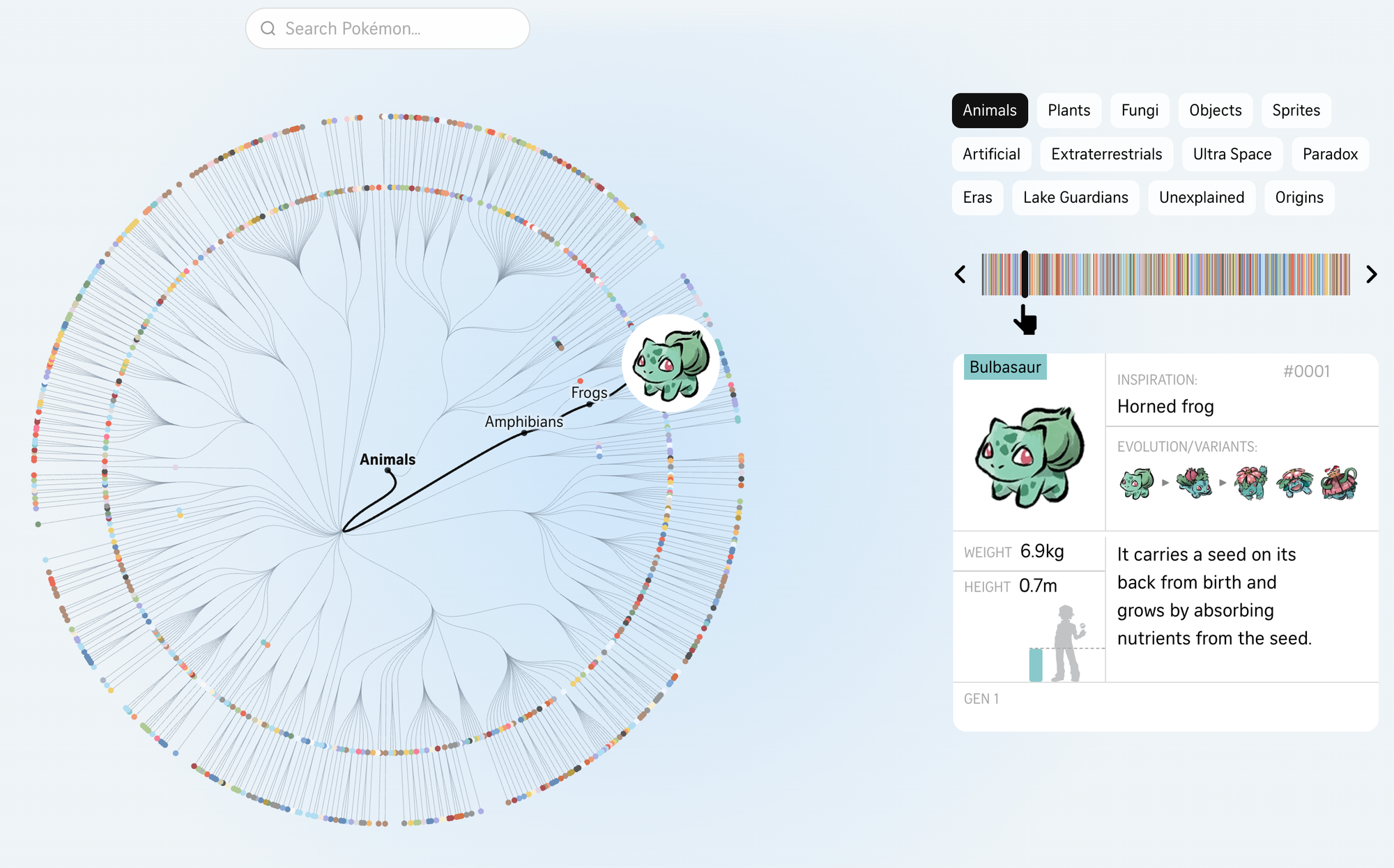
Remember Pokémon? It's celebrating its 30th anniversary this year. When the Straits Times heard this, the digital graphics team said: "hold my Poké ball." Behold! A scientific, interactive diagram of all the species.
Remember MythBusters? The algorithm recently graced me with a clip from their 2011 episode about the Monty Hall Problem — a probability puzzle with a correct answer that feels completely wrong. These guys, though, have the best explanation I've seen.
MORE NOT-SHIP
Member discussion