
Hello! I've been thinking a lot lately about how we communicate the impacts of climate change, particularly with respect to diagrams and charts. Turns out I'm not the only one! More about this — and a new subscriber perk! — at the end of this week's dispatch.
💙 Amanda
We're living through the warmest period in the whole of human civilization. And it's gonna get hotter yet. How the hell do we communicate that?
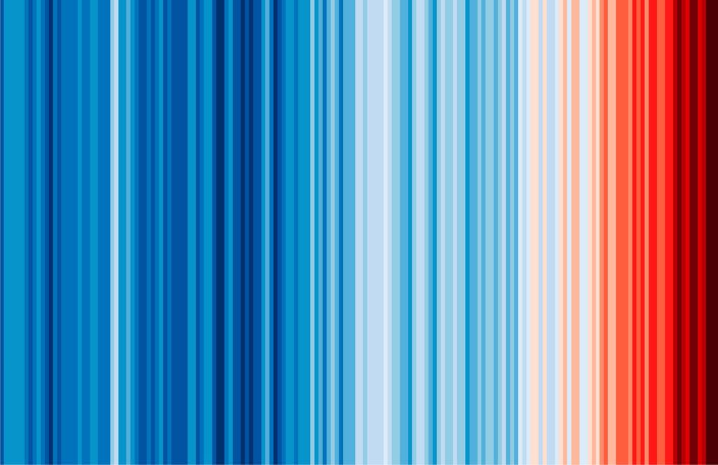
Ed Hawkins, a professor of climate science at the University of Reading, decided on stripes. In particular, these stripes:
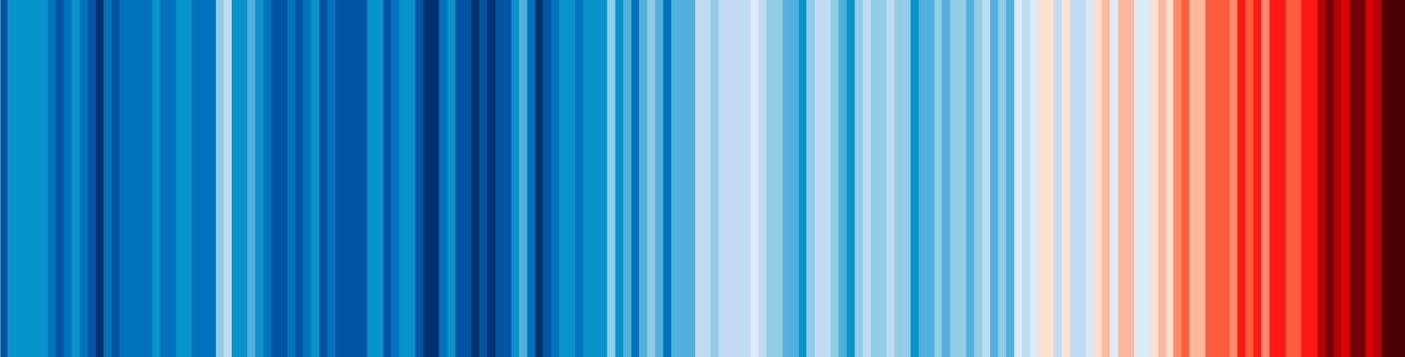
Usually called 'climate stripes' or 'warming stripes', they show how the Earth's temperature has changed over time. And I'd be surprised if this is the first time you're seeing them.
First shared in 2018, the data visualization quickly spread around the globe. The stripes have been projected onto the Tower of London, the White Cliffs of Dover and Times Square. They can be found on t-shirts, banners, books, flags, buses and buildings.
Ten years ago, it was the polar bear. Now, this chart is likely the most well-known visual shorthand for 'climate change.'
But as a data visualization, it actually does a lot of things wrong.
What the stripes show
Each stripe is one year of global average temperature since 1850. They are coloured by how much warmer or cooler each year was than the 1961–2010 average. Blue indicates cooler years and red indicates warmer ones.
Here's another way to visualize the same data:
Global temperature change each year, 1850 to 2025
Change relative to the 1961–2010 average temperature.
The stripes themselves have no axis to explain what years we're looking at. They have no scale to show the magnitude of the temperature changes, and no key to indicate what the colours mean. In fact, there are no words or numbers at all on the visualization.
It's no surprise then, that the stripes are not particularly good at conveying data. As far as I can tell, there's only been one study of their effectiveness. It found that people who looked at the warming stripes were not able to accurately determine by how many degrees Celsius the annual global temperature has changed since 1850.
But a study like this misses the whole point of the warming stripes. The lack of detail, the missing axis — these were conscious decisions. And the visualization was never meant to help people estimate temperatures.
Why the stripes work
In designing the warming stripes, Hawkins' goal was to spread awareness and get people talking.
"These graphics are simple and bright, but they’re based on solid science and carry a serious message. They translate complex data into an easily accessible format that transcends language and needs almost no context to explain it," Hawkins wrote in 2019. "My research has often focused on communicating the impacts of climate change to new audiences. The more people that see and understand this huge problem, the better chance we have of solving it."
There's a common misconception that data visualization always needs to be an analytical tool. But like any other medium, it can be used in all kinds of ways.
"Data visualization can be used for journalism, for business analytics, for statistics, for art, for expression, for self discovery" said Alberto Cairo, a data visualization designer and professor at the University of Miami, in a 2023 interview.
Cairo interviewed Hawkins for his book The Art of Insight, and says the stripes were never meant to convey the numbers.
"It was designed with the specific and explicit purpose not to provide an analytical tool to explore the data but as something that brought attention to the information, something that ignited curiosity in the viewers," Cairo said. "And I think that if that is the purpose, the outcomes actually match really well what he had in mind, and therefore the visualization works."
And despite having few of the traditional trappings of a good data visualization — or maybe because of that — the graph has been wildly popular. Partly that's because the stripes don't break every rule. We're used to seeing time flow from left to right, and we know that red means warm and blue means cool.
It helps, too, that the visual is simple, striking and free to use. In 2018, Climate Central and a US TV meteorologist kicked off an international campaign to encourage weather broadcasters to use the graphic during their TV segments. Presenters in more than 40 countries participated. June 21 is the annual #ShowYourStripes Day.
Communicating the impact of climate change is a real challenge. The message is simultaneously scary, overwhelming, and, if we're honest, sometimes a bit boring. No single chart, story or photo can carry all that (though the polar bear did put in a herculean effort). We need every tool we've got: investigative journalism, line charts with error bars, critical movies, speculative novels, scientific papers, hopeful poems and a few blue and red stripes.
Each region experiences global temperature change differently. Use the #ShowYourStripes website to create warming stripes for where you live.
COME WITH ME!
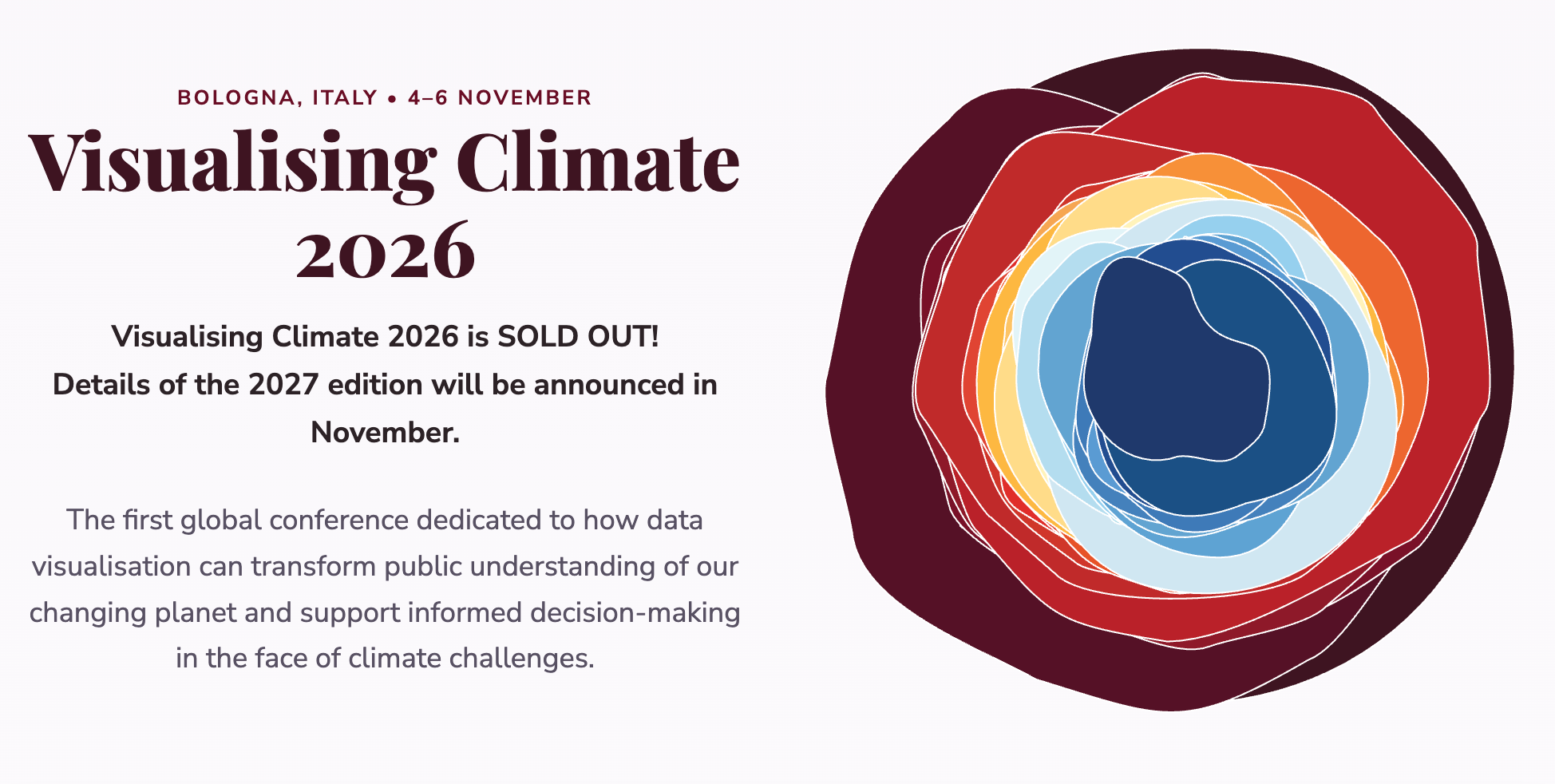
Speaking of climate charts ... At the beginning of November, I'll be at the inaugural Visualising Climate conference. For three days, scientists, journalists, artists and designers will meet for talks and workshops on how data visualization can help people understand, and act on, a changing climate.
And you can come along (via newsletter)! Each day of the conference, I'll write a roundup of what I see, what I learn and who I meet — exclusively for Not-Ship's paid members.
It's just $9/month or $90/year. Sign up now so you don't miss these special dispatches!
FROM ELSEWHERE
Here's what I found interesting, important or delightful this week:
Plagiarism politics. In Bed With the Right is a great podcast that dissects right wing preoccupations. Check out this episode that explains how a German concern with academic fraud led to today's plague of plagiarism hunting.
One, relentless sentence. Angel Down, Daniel Kraus' cinematic novel about the horror of war, won this year's Pulitzer Prize for fiction. It's written as a single sentence (don't worry, it works really well) and is unlike anything I've read. Recommend!
MORE NOT-SHIP
 Amanda Shendruk
 Amanda Shendruk
 Amanda Shendruk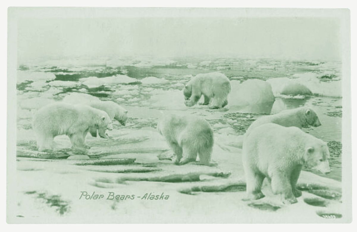
Member discussion