

Today's dispatch isn't what I wanted it to be. I'll be honest: Things just didn't turn out. If you want to support this work — work that won't get published if it just doesn't fit our rigorous standards! — you know what to do.
💙 Amanda
There's a piece I've wanted to publish for a long time. And this was going to be the day! It's a simple and straightforward idea, and I thought I'd finally found the data to pull it off. (You know that feeling when you get your hands on just the right, totally niche, dataset? I was, as the Brits say, chuffed.)
But that was last week. Between then and now, I've lived many lifetimes. I've skimmed through thousands of screenshots, dug into the source code of the Wayback Machine archives, and endured pages and pages of industry white papers. I even wandered, briefly, onto the US Department of Justice Antitrust Division website.
And yet, I have nothing to publish today. Yesterday, stuck in a rabbit hole of caveats, I pulled the plug.
What's got me stumped? I'll break it down in a minute. But first, I figured I'd use today's email to introduce you to the brand new Not-Ship data library!
The Not-Ship data library
Paid members have always had access to the data I chart each week. But until yesterday, the setup was bare-bones: Google Sheets all the way down.
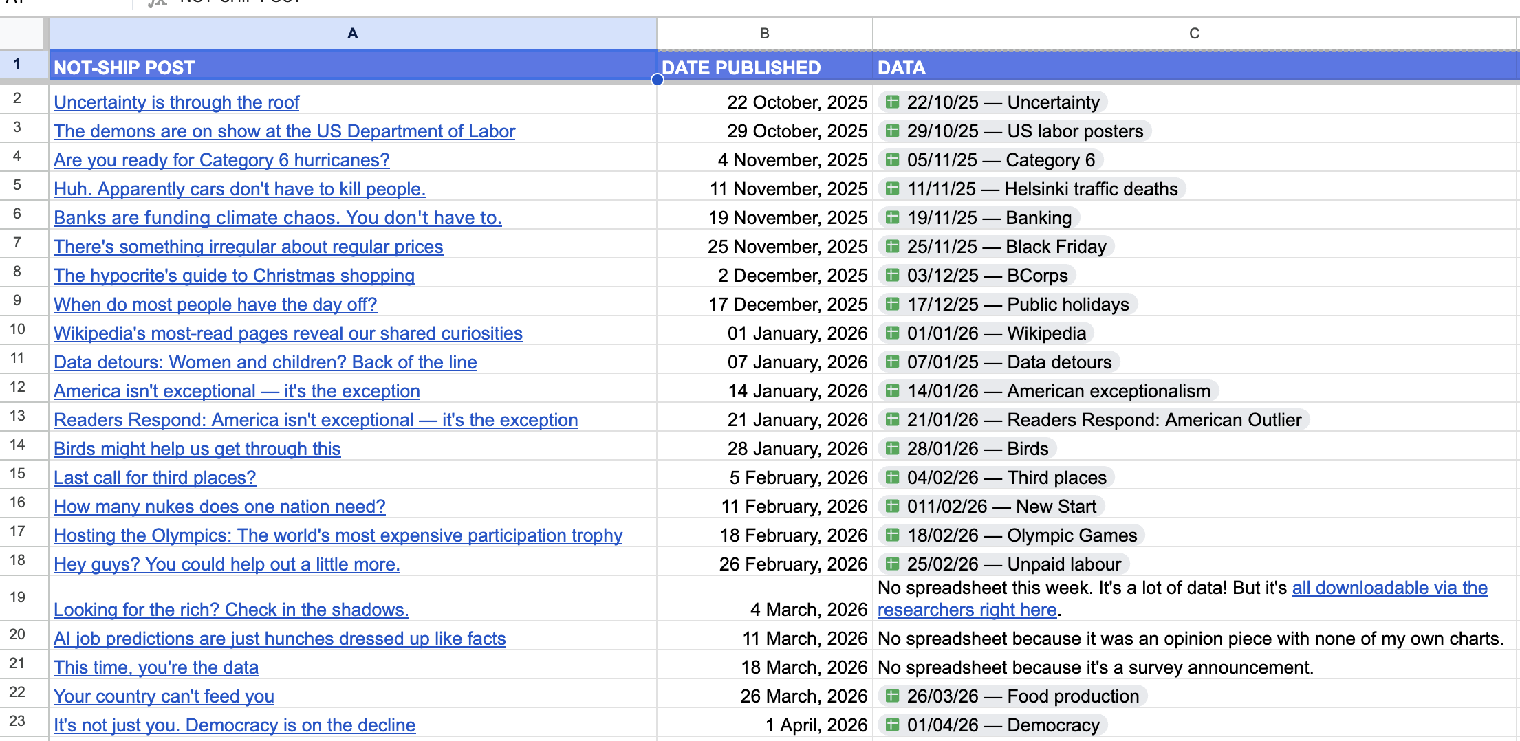
This wasn't ideal. It meant I had to manually add subscribers to the shared spreadsheets. And it meant that those who didn't want to use Google products were kept out.
Here's what it looks like today:

Now, all paid members can get to the data library right on the Not-Ship website. As long as you're signed in to your account, you'll have no problem.
Here's how you can find it:
Each week, you can easily download a spreadsheet with all the data I used in this newsletter. That means you can see how often the Pope topped Wikipedia in 2025, check on the immigration policies of hundreds of political parties, or find out how un-helpful the men in your country are.
Want access to that? It's all yours for $9/month (or $90/year).
Ok, now back to my data dilemma...
Let me Google that for you
Google sucks now. Low-quality results, spam-like content and advertisements drown out anything useful. I'm not telling you anything you don't know, but I wanted to see how we got here. I wanted to show how, over the last few decades, ads have taken up more and more space on the results pages. Simple, right?
Researchers at the University of Porto have a public dataset of Google results pages over time: Thousands of screen captures from the Wayback Machine. Perfect!
But going through them, I found something weird. Somewhere around 2015 the ads start disappearing. Turns out, this is likely because Google's ads and sponsored content are loaded dynamically via a real-time bidding process that the Wayback Machine's crawler can't replicate — so in archived pages, the ad slots simply show up empty. Which rendered the thousands and thousands of Google screenshots useless to me.
I tried to find screenshots elsewhere: Places like Search Engine Roundtable, Search Engine Land, and even in the trial exhibits from the Google antitrust lawsuit in the US! But there was nothing comprehensive enough. No academic studies, no white papers. As far as I can tell, nobody has systematically documented this. For the world's dominant information source, that's a bit remarkable.
So, I'm stumped. Ideas for where I can look next? Let me know. This is my white whale now.
Next week, back to our regular programming! Thanks for sticking around through this detour.
FROM ELSEWHERE
Here's what I found interesting, important or delightful this week:
On measuring. Put some philosophers in a bar and what do you get? It's Hotel Bar Sessions, one of my favourite podcasts. Their recent episode on Goodhart's law is great. When the measure becomes the target, it ceases to be a good measure. Discuss.
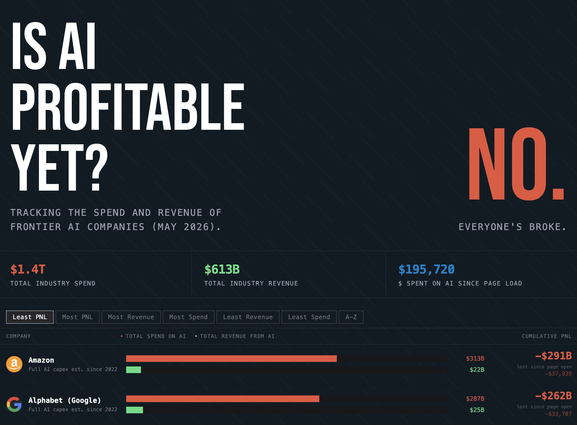
Is AI profitable yet? A quick click for the answer. Check whenever you need a reminder.
People of the future. Our World In Data launched a tool that allows you to check on populations of the future. By 2100: Watch Japan's population drop nearly in half, while the US adds 40 million.
MORE NOT-SHIP
 Amanda Shendruk
 Amanda Shendruk
 Amanda Shendruk
Member discussion